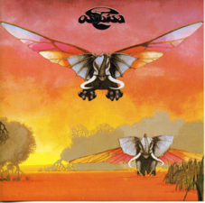
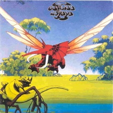
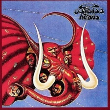
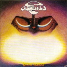
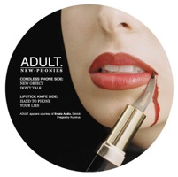
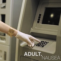
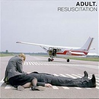
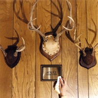
Osibisa

Osibisa were an Afro-pop band popular during the 1970s. Though formed in the United Kingdom by seven multitalented musicians, four of them hailed from Africa and three the Caribbean. Their first few albums and one released much later feature monstrous, winged elephants. The covers of their debut and sophomore efforts are by Roger Dean, known for painting fanciful album covers throughout the 1970s for many bands. Vivid colors and mysterious, African-like landscapes fill the scenes, from the Savannah plain to a swampy jungle. Dean also designed the wispy logotype for Osibisa, which has been in use on almost every album cover since.
Roger_Dean-Osibisa

Adult. Album Covers

ADULT. are an electroclash husband-and-wife duo. The choice of displaying their name in all-caps with a period gives a punch and finality to it. Both possessing art degrees, it is not surprising that the artists themselves are responsible for creating their album artwork. Nicola Kuperus, not only provides the vocals for their rough sound but also utilizes her photographic skill to craft the mysterious yet grim scenes that grace the covers of ADULT.’s output. The subjects are very consistent: a woman without her face ever revealed in an almost artificial situation. Many of them appear distressed or nefarious, further adding to the aggressive aesthetic for the group. Another noticeable element is the use of all-caps Helvetica typographically, which its plain, neutral look gives more power to the expressive photographs.

Brian Eno's Ambient Series

It seems that while I’m at it, I should share the series that musician Brian Eno started after ending the Obscure Label. The Ambient label Eno created in 1978 released four albums through 1982, featuring a minimalist approach to creating music that Eno had termed “ambient”. The music is meant to be unobtrusive so one could have it play in the background while rewarding those who pay attention to the subtleties in the music.

Ambient 1: Music for Airports Ambient 2: Plateaux of MirrorAmbient 3: Day of Radiance Ambient 4: On Land

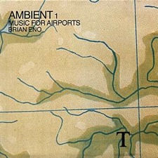
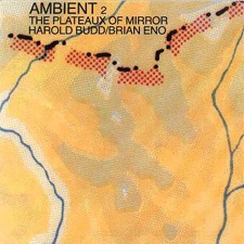
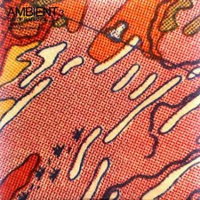
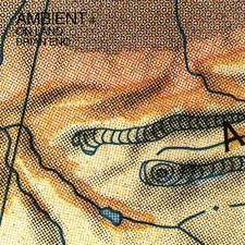
Each of the four albums is given the title “Ambient”, following whatever number release it was, and a more descriptive title after that. The use of Helvetica type in the top left corner is not unlike the typography of the Obscure Label album covers. However, each cover features a section from a colorful map, each varying in scale and terrain it depicts. I am not 100% positive where the idea for using maps for the covers originates, but I believe it starts with the first album, titled Ambient 1: Music for Airports, which Eno was inspired to compose for use in airport terminals where the busy atmosphere never ceases. The notion of airports with travel and maps are associated with travel makes me suspect this could be the intent of the design.

1978, Ambient 1: Music for Airports by Brian Eno
1980, Ambient 2: The Plateaux of Mirror by Harold Budd/Brian Eno
1980, Ambient 3: Day of Radiance by Laraaji, produced by Brian Eno
1982, Ambient 4: On Land by Brian Eno

Brian Eno's Obscure Label

In music, the album art does not necessarily have to follow a series just for a single artist. When the multi-genre avant-garde musician Brian Eno created the Obscure record label in 1975, he created a means for showcasing new experimental pieces of work by primarily obscure musicians to a wider audience, hence the name of the label. No fewer than ten records were released on the Obscure label until 1978, when Eno started his “Ambient” series, which I will feature in a later post.

All ten albums in the series feature the same background image formed from overprinting a photo of a city with black ink. However, each album – with the exception of one – has a unique small section that reveals the brightly-colored image underneath. The artist and title for each album remains consistently in the upper left in white Helvetica type. One could interpret these covers represent how this series is bringing each of these works out of obscurity, as the windows showing the photo underneath share what it is obscured by the overprint of the black ink.

The Sinking of the Titanic – Gavin Bryars Ensemble Pieces – Christopher Hobbs, John Adams, Gavin BryarsDiscreet Music – Brian Eno New and Rediscovered Musical Instruments – Max Eastley, David ToopVoices and Instruments – Jan Steele, John Cage Decay Music – Michael NymanMusic from the Penguin Café – Members of the Penguin Café Orchestra Machine Music – John White, Gavin BryarsIrma – an opera by Tom Phillips, music by Gavin Bryars, libretto by Fred Orto The Pavilion of Dreams – Harold Budd


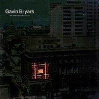
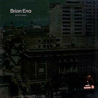
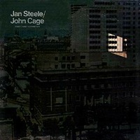
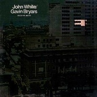
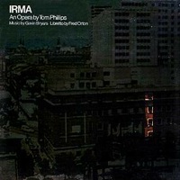
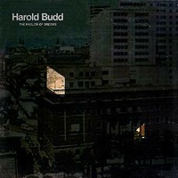
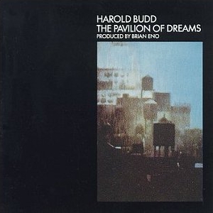
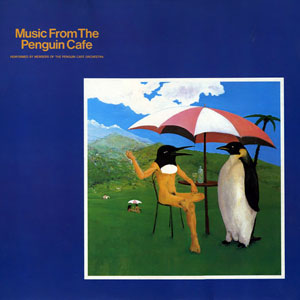
John Bonis of CCS was responsible for the design of the covers for the series. I am not able to find any other information on him or his work other than this project. After the departure of the Obscure label, some of the artists have released their albums with different album art, including Eno’s Discreet Music, Budd’s The Pavilion of Dreams, and The Penguin Café Orchestra’s Music from the Penguin Café Orchestra, making them part of the canon of their body of works. Unfortunately, at least half of these albums have not seen a release on CD, let alone a vinyl reprint, since 1982 on the EG Records label.

1975, The Sinking of the Titanic by Gavin Bryars
1975, Ensemble Pieces by Christopher Hobbs, John Adams, Gavin Bryars
1975, Discreet Music by Brian Eno
1975, New and Rediscovered Musical Instruments by Max Eastley, David Toop
1976, Voices and Instruments by Jan Steele, John Cage
1976, Decay Music by Michael Nyman
1976, Music from the Penguin Café by Members of the Penguin Café Orchestra
1978, Machine Music by John White, Gavin Bryars
1978, Irma an opera by Tom Phillips, music by Gavin Bryars, libretto by Fred Orton
1978, The Pavilion of Dreams by Harold Budd

Def Leppard's "Hysteria" and Singles

For the moment, I have been diving through my rather large music collection and looking for some material that runs in a series. I intend to cover other mediums as well, but for now I will indulge through what I have collected.

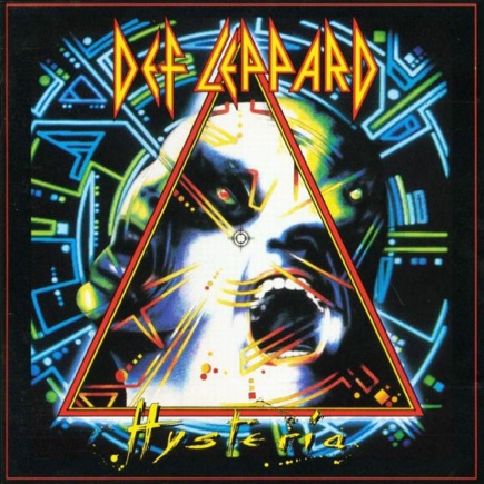
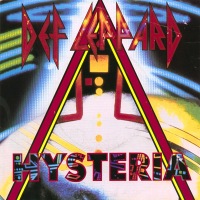
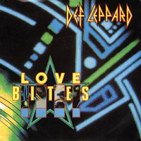
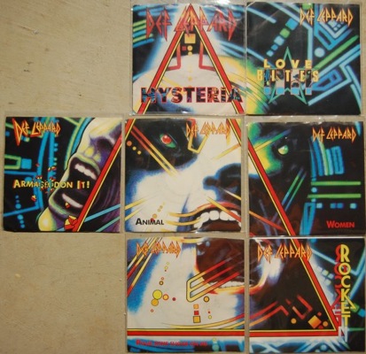
Continuing on to hard rock/metal band Def Leppard’s 1987 multi-platinum seller Hysteria, which was followed by no fewer than seven singles. The cover for the album and singles were designed by Andie Airfix of Satori, whom had designed previous covers for the band as well.

At first when you look at the album and singles, it appears the background of each single is a different crop of the main album art.

Hysteria album

Women Animal Hysteria single Pour Some Sugar on Me Love Bites Armageddon It Rocket

However, when I was browsing for album covers with CoverScout, I came across an interesting discovery that I never would have noticed on my own. I don’t think I’ve ever seen singles so painstakingly fit together design-wise with their parent album like puzzle pieces in this way. Kudos to whoever noticed this! I’ll be on the lookout for any other singles that do anything similar to this.


Hysteria singles together
(image via here)

1987, Hysteria album
1987, “Women” single
1987, “Animal” single
1987, “Hysteria” single
1988, “Pour Some Sugar on Me” single
1988, “Armageddon It” single
1989, “Rocket” single

Follow-Up: Belle and Sebastian & Arab Strap

It has been brought to my attention the similarities of some of the album, EP, and single covers of the also Glasgow-based indie rock band Arab Strap that also formed in the mid 1990s to Belle and Sebastian’s. The look and feel bring an interesting question of how intentional was this resemblance. I have included here the Arab Strap covers that particularly bear the characteristics these similar bands share. So was it a matter of cultural influence or clear intention? You be the judge.

Here We Go & Trippy (Afternoon) Soaps Elephant Shoe Monday at the Hug & Pint The Shy Retirer Dream Sequence Speed Date

1998, “Here We Go/Trippy” single
1998, “(Afternoon) Soaps” single
1999, Elephant Shoe album
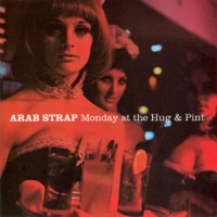
2003, Monday at the Hug & Pint album
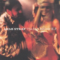
2003, The Shy Retirer EP
2005, “Dream Sequence” single
2006, “Speed Date” single

Belle and Sebastian Album Covers

Where to begin? There seems to be an endless amount of album covers that follow in a series. Taking a look first at the Scottish indie rock band Belle and Sebastian’s album covers, there appears to be no mistaking what is the norm. Moody, monotone photographs capturing fleeting emotions with a candid look of the persons depicted. Most of their EPs and singles also follow the same style.

Tigermilk If You're Feeling Sinister The Boy with the Arab Strap Fold Your Hands Child, You Walk Like A Peasant Storytelling Dear Catastrophe Waitress The Life Pursuit

1996, Tigermilk
1996, If You’re Feeling Sinister
1998, The Boy with the Arab Strap
2000, Fold Your Hands Child, You Walk Like a Peasant
2002, Storytelling
2003, Dear Catastrophe Waitress
2006, The Life Pursuit